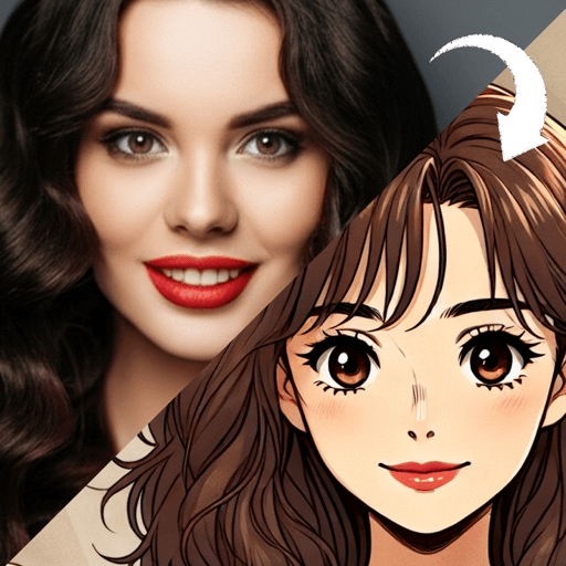
Turning a photo into a cartoon is three decisions, not one. You pick the photo, you pick the style, and you decide what to change when the first result is wrong. The tool matters least. A close, evenly lit, straight-on face converts well almost anywhere, and a dim group shot converts badly everywhere.
Most guides go straight to the tool, which is the part that makes the least difference. What follows is the other two thirds: how to choose the photo, how to choose the look, and how to read a bad result so the second attempt fixes the actual problem instead of just being another attempt.
What decides whether a cartoon of you looks good?
Every cartoon style is a compression. Tate’s definition of caricature is a drawing in which the features and form have been distorted and exaggerated, and while not every cartoon look is a caricature, all of them work the same way: throw most of the information away, then push what is left.
That means the result depends on what there is to push. The Wikipedia article on caricature sets out the three things a caricaturist actually draws on: natural characteristics, the ones you were born with, like a long nose or big ears; acquired characteristics, meaning things like facial lines and a stoop; and what it calls the vanities, the hair style, the glasses, the clothes, the expressions and the mannerisms you chose. The word itself comes from the Italian caricare, to charge or load, which is why the article describes a caricature as an overloaded portrait.
A generated cartoon has to find those same three buckets in your photograph. If the photo hides them, under a hat, under shadow, at an angle, or simply too far away, there is nothing to load. You will get a generic drawn face, and it will not be the style’s fault.
Which photo should you start with?
Go through these in order. The first three do most of the work.
- Face size in the frame. The head should fill a good third of the picture. Crop in before you convert if you need to. This single check fixes more bad results than every other item here combined.
- Even light from the front. A window in front of you beats a window behind you. Backlight puts your whole face in shadow, and a style that reduces skin to two or three tones has nothing to work with.
- Straight on, both eyes visible. Most looks push proportion. A three-quarter or tilted angle gets pushed too, and the asymmetry is what reads as wrong.
- Hair and head uncovered. Silhouette carries most of the recognition, especially at small sizes. Hoods and caps flatten it.
- Headroom. Styles that enlarge the head need somewhere to put it. Leave a little space above your hair rather than cropping tight to the scalp.
- One person. Group shots split the attention of the conversion and usually give everyone a slightly wrong face. Crop to one person and run them separately.
- The original file, not a screenshot. A screenshot of a photo that was already sent through a chat app has been compressed twice. That softness survives into the drawing as mush.
None of this requires a good camera. It requires standing near a window and holding the phone a bit closer than feels natural.
How do you pick a style?
There are far more looks than there are decisions. Almost every style sits in one of five families, and choosing the family first is faster than scrolling through names.
Line-driven looks build the whole image out of contour and hatching. The Victoria and Albert Museum describes manga art as tending to focus on line over form, with lines used to express movement and shadow, hatching and strokes creating texture and depth. That is the family trait, and it covers the comic book filter, the pencil sketch filter and the manga style portrait. These reward strong bone structure and clear shadows, and they are unforgiving of flat, evenly lit faces with no contrast to draw.
Flat printed color keeps the outline but fills it with a handful of saturated blocks. The retro cartoon filter and the pop art portrait both work this way. They are the most reliable family for a profile picture because they read at any size, and the most likely to lose a subtle face, since everything becomes a few confident shapes.
Painted looks soften every edge instead of hardening it. The watercolor portrait, the oil painting portrait and the storybook illustration belong here. They flatter most faces and photograph poorly at thumbnail size, so they suit a post or a print more than an avatar.
Rendered looks are built rather than drawn: a shape is constructed and then lit, instead of a line being laid down. The 3D cartoon avatar and the voxel art avatar both work this way, and because they carry real highlights and cast shadows they hold up on a dark background where flat styles can disappear.
Proportion-driven looks change your shape rather than your surface. The chibi avatar and the caricature generator are the two ends of this: one shrinks you toward a head with a small body attached, the other pushes whatever is already distinctive further. Both need a clear expression to work from, because they exaggerate exactly what you give them.
If you cannot decide, run the same photo through one style from two different families. The contrast tells you more about what you want than any description does.
What do you do when the first result is wrong?
Bad results fail in three recognizable ways, and each one points at a different fix.
It came out mushy. Soft edges, smeared features, a face that looks slightly melted. This is nearly always the source photo: too small in frame, too compressed, or too soft to begin with. Re-crop and run it again rather than switching style.
It came out as someone else. The style pushed a feature that was not really there, usually because the light hid the ones that were. Shoot again facing a window. A style that exaggerates proportion will also exaggerate a bad angle.
It came out plastic. Skin too smooth, eyes too even, the whole thing slightly lifeless. Try a family that keeps visible marks, a line-driven or painted look rather than a rendered one.
And regenerate before you conclude anything. A generation is an interpretation of your photo rather than a tracing of it, so two runs of the same image are genuinely different pictures. The second or third is often the one you keep.
How should you crop it for a profile picture?
At forty pixels wide, three things survive: the silhouette, the contrast between the face and the background, and one readable feature, usually the eyes or the hair shape. Everything else is decoration. Crop so the head sits high in the square with a little air above it, and check it at actual size before you commit, because the version you are admiring at full screen is not the version anyone else will see.
One last thing worth knowing. Tate’s note on portraiture is that portraits have almost always been flattering, and that painters who refused to flatter tended to find their work rejected. That has been true for about five thousand years and it is still true of a cartoon you are choosing for a profile. Picking the version you like best is not vanity, it is the entire tradition.
Toonsta is one place to run this method, and it is built around it: upload the photo, pick a style, generate, regenerate until one is right. The styles it ships are the 3D cartoon avatar, the voxel art avatar, the retro cartoon filter, the storybook illustration and the anime style filter, so it covers the rendered, flat-color and painted families with new looks added over time. The other styles described above are explained on their own pages as reference, not as things the app currently makes.