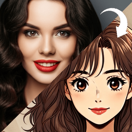
Turning a photo into pixel art sounds like one effect, but it is really two decisions made on your behalf: how coarse the grid is, and how few colors are allowed. Get those two right for the photo in front of you and the result looks drawn. Get them wrong and it looks like a photo that failed to load.
Photo to pixel art conversion works in two steps. The photo is shrunk to a small grid, usually a few dozen squares across, with each square taking the average color of the area it covers. Then every square is snapped to the nearest color in a small palette. The grid size and the palette decide almost everything about the result.
What does a photo to pixel art converter actually do?
The first step is downscaling. A phone photo is thousands of pixels wide; the converter collapses blocks of them into single squares and then scales the result back up with hard edges, so each square is visible.
The second step has a proper name. Wikipedia describes color quantization as a process that reduces the number of distinct colors used in an image, usually so that the new image stays as visually similar as possible to the original. The same article notes it is frequently combined with dithering, which hides the banding that appears when a smooth gradient is forced into a few flat tones. The article notes that display hardware long supported only 2, 4, 16 or eventually 256 colors, which is where pixel art’s small palettes come from.
Everything a converter offers on top, sliders for “pixel size” and “colors”, is a control over those two steps.
Why do some conversions look like real pixel art and others look like a blurry thumbnail?
Because real pixel art is not defined by being low resolution. In Wikipedia’s account, an image is usually considered pixel art when deliberate thought was put into each individual pixel, and standard digital images and low-resolution photographs are made of pixels too, but would only count as pixel art if the pixels were placed with artistic intent.
A straight downscale has no intent. It averages, and averaging is what makes edges soft and faces muddy. Hand-made pixel art does three things an average never does:
- It outlines. A dark line of single pixels around the head and features holds the shape together.
- It clusters. Each color sits in clean, readable groups instead of a speckle of near-identical tones.
- It chooses. Wikipedia notes pixel artists tend to apply a single color at a time and avoid soft edges, smudging and blurring. Two eyes are placed, not sampled.
So when you compare converters, look for those three marks of intent. A result with a clean outline, tidy color clusters and two clearly placed eyes was redrawn on the grid rather than averaged, and it will read as a face at a grid size where a plain downscale is only a smear.
How wide should the grid be for a face?
This is the setting that matters most for a portrait. The useful way to think about it is how many squares cross the face itself, not the whole image. These ranges are a working rule of thumb rather than a standard:
- About 8 to 12 squares across the face. Icon territory. The eyes are one square each or a short bar, the nose is gone, and recognition comes entirely from the hair shape and the colors. Striking at tiny sizes, but it could be almost anyone with your haircut.
- About 16 to 24 squares across the face. The sweet spot for most avatars. Eyes get two or three squares with room for a highlight, the mouth can curve, glasses and a beard read clearly.
- About 32 squares or more across the face. Expressions start to appear, but so does photographic noise. Past this point a conversion stops looking like pixel art and starts looking like a low-quality photo, unless the palette is kept small.
So if the face fills half the frame, a grid of 32 to 48 squares across the whole image puts you in the sweet spot. If the face is small in a wide shot, you need a far finer grid to give it the same detail, which is why cropping first is the single most useful thing you can do.
How many colors should you allow?
Fewer than you expect. Pixel art, Wikipedia notes, commonly restricts its palette, partly for the look and partly to reduce perceived noise. As a rule of thumb, 8 to 16 colors is usually enough for a portrait: two or three skin tones, two for hair, a dark outline, a highlight, a background and a few for clothing.
Raising the color count does not make the result better. Past a point, it brings back the subtle photographic gradients that the grid cannot carry, and you get noisy skin rather than clean bands of tone.
Which photos convert well, and which do not?
Pixel art is the same idea as a much older one. Tate defines a mosaic as a picture made of small parts, traditionally tiny tiles of terracotta, glass, ceramic or marble, and the same rule applies to both: small uniform units can only describe big, clear shapes.
Photos that convert well:
- Cropped tight. Head and shoulders filling the frame, so the face gets as many squares as possible.
- Evenly lit. A soft front light keeps the skin as one or two tones. Hard shadows become dark blotches that look like dirt at this scale.
- Strong color separation. Hair, skin, top and background each clearly different. If your hair is close to the background color, the outline of your head disappears.
- A plain background. Busy backgrounds turn into a confetti of squares that competes with the face.
Photos that convert badly: group shots (each face gets too few squares), strong backlight (the face becomes one dark block), thin details like earrings, necklaces and fine glasses frames (anything narrower than a square vanishes), and patterned clothing (it turns into noise).
How do you judge a result in ten seconds?
Shrink it. View the result at the size it will actually be used, a profile picture or an emote, and ask three questions. Can you tell where the hair stops and the background starts? Can you find both eyes immediately? Is there one feature, glasses, a beard, a bright top, that makes it yours? If all three are yes, keep it. If the eyes have merged into the skin, try a finer grid or a photo with more light on the face.
Is pixel art the right look for you?
Pixel art carries a lot of history for a small image. The Smithsonian American Art Museum’s exhibition The Art of Video Games surveyed the forty-year evolution of video games as an artistic medium, and the blocky look is part of that inheritance, which is why it suits gaming handles, streams and chat emotes. Our pixel art filter page covers the look itself and the shooting checks in more detail, and cartoon profile picture ideas compares it with other looks by how well each reads at thumbnail size.
If you like the grid but want depth, what voxel art is explains the three-dimensional version, where the squares become lit cubes. And if what you actually like is the flat, outlined simplicity rather than the squares, the retro cartoon filter gets there with smooth lines instead. The photo advice also differs from line-based looks; photo to sketch explains why those want the opposite kind of light.
Toonsta does not have a pixel art style. The closest look it ships is the voxel art avatar, which keeps the blocky grid and the bold color but builds it from small lit cubes rather than flat squares. If that sounds like what you were after, upload a tightly cropped, evenly lit photo and regenerate a couple of times, since each run places the blocks a little differently.