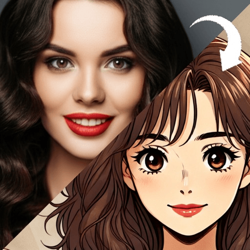
A photo to sketch conversion throws away color and keeps two things: edges and tone. It draws lines where your photo changes sharply from light to dark, then fills the shadows with strokes. That means it needs directional light and real contrast, which is the opposite of the flat, even front light most cartoon looks prefer.
This catches a lot of people out. The photo that gave you a great cartoon, softly lit and facing a window, often produces a pale, empty sketch that looks like a page from a coloring book. Nothing is wrong with the converter. It simply had nothing to draw.
What does a photo to sketch converter keep?
Two kinds of information, and nothing else.
Edges. Anywhere the photo shifts suddenly from light to dark, the outline of your jaw against a wall, the line of your hair, the edge of your glasses, becomes a drawn line. The sharper the shift, the more confident the line.
Tone. Tate defines tone as the lightness or darkness of something, and it is the only other thing a monochrome sketch has to work with once color is gone. Dark areas of your photo become dense strokes; light areas are left as bare paper.
The way those strokes are laid down is an old technique. Wikipedia describes hatching as a way of creating tonal or shading effects with closely spaced parallel lines, called cross-hatching when the lines are set at an angle to one another, and notes that it matters most in essentially linear media such as drawing and engraving. A sketch conversion is hatching by translation: every shadow in your photo gets turned into a patch of lines.
Everything else is gone. Your skin color, your eye color, the color of your top and the background: all of it becomes gray values or paper.
Why does a sketch need a different photo from a cartoon?
Because the two looks want opposite things from the light.
Most cartoon and anime looks replace shading with flat color, so they do best with even, front-facing light that shows your features clearly and casts few shadows. The advice in how to turn a photo into a cartoon is built on that: face a window, avoid backlight, keep the light even.
A sketch has no flat color to fall back on. Without shadows, the only lines it can find are outlines, so a flat-lit face becomes a thin contour floating on white. To get a sketch with depth, you want shadows on purpose:
- Light from one side. Stand so the window is at roughly forty-five degrees to your face. One cheek lit, the other falling into shadow. This single change gives the conversion the tonal pattern it builds on.
- A background that contrasts with your hair. Dark hair against a pale wall, or light hair against a dark one. Pale hair against a bright sky is the classic failure: both become white paper and your head loses its top.
- A plain background. Every edge in the frame gets drawn. A bookshelf behind you becomes a hundred lines competing with your face.
- A sharp original. Softness in the photo becomes hesitant, fuzzy lines. Use the original file, not a screenshot of a forwarded image.
This is the same logic that makes oil painting looks want side light, described in what survives a painting conversion. The line-based and oil families both model form with light and shade. The flat-color families do not.
Graphite or charcoal: which sketch look suits your photo?
Most sketch options copy one of two materials, and each behaves differently.
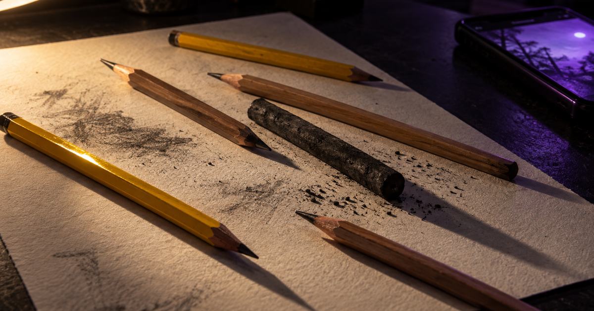
Graphite is the pencil look. Tate describes graphite as a metallic gray drawing material, most often used in pencil form, that needs only the slightest pressure to leave a mark. That precision is why a graphite-style pencil sketch filter can hold fine detail: individual strands of hair, the shape of an eyelid, the rim of a pair of glasses. It suits detailed faces photographed sharply, and it suits people who want the result to look careful.
Charcoal is the bold look. Tate describes charcoal as a black, crumbly material whose line is dense at the pressure point and more diffuse or powdery at the edges, less precise than hard graphite and suited to freer studies. A charcoal conversion gives you deep blacks and soft, smudged transitions, and it drops fine detail. It suits strong faces, dramatic side light and photos where the shadows do most of the work.
If your photo is soft or a little underexposed, charcoal hides it better. If your photo is crisp and you want to keep every detail, graphite.
What about other line-based looks?
Several popular looks are sketches with extra rules, and the same photo advice applies to all of them.
A comic book filter look keeps an inked contour, collapses shadows into solid black shapes and adds flat printed color. Strong side light gives it bold, graphic shadows; flat light gives it a thin outline and nothing inside.
A manga style portrait look works in black, white and gray, with hatching where shadow falls and dot screens for mid tones. It needs a clear light-dark pattern just as much as a pencil sketch does.
If you want to try the drawing yourself, how to draw yourself as a cartoon walks through building a face from a few lines, which is also a good way to understand what a sketch converter is looking for.
How do you judge a sketch result?
Four quick checks:
- Do the eyes have real lines? If the eyes are faint smudges, the photo was too flat or too soft. Reshoot with side light.
- Does the hatching follow the form? Strokes should curve around the cheek and jaw rather than running in one flat direction across everything.
- Is the background quiet? If the background has more lines than your face, crop tighter or find a plainer wall.
- Does the head have a top? Check that pale hair has not vanished into a pale background.
A generation is an interpretation of your photo, so a second run often places the strokes differently. If the checks fail on the same points twice, change the photo rather than the tool.
Which tool should you use for photo to sketch?
The honest set is the same as for any conversion: free web converters for testing a look, general photo editors that include a sketch effect, dedicated apps focused on faces, and, if you want a drawing with real decisions in it, a person with a pencil.
Toonsta does not currently ship a sketch look, and that is worth saying plainly. The five styles in the app are the 3D cartoon avatar, the voxel art avatar, the retro cartoon filter, the storybook illustration and the anime style filter. If what you like about sketches is the confident line, the retro cartoon filter is the closest thing it makes: a heavy outline around flat color, and far more forgiving of an ordinary phone photo than a sketch is.