When you turn a photo into a painting, the converter replaces photographic detail with the logic of a paint medium: blended color and visible brushwork for oil, transparent washes and bare-paper highlights for watercolor. What survives is the big pattern of light and dark and the main blocks of color. Fine texture, small text and busy backgrounds do not.
That one sentence predicts most results. A camera records everything at the same level of detail. A painter, and a painting conversion, decides what matters and lets the rest dissolve into brushwork. If your photo’s important parts are also its biggest, clearest shapes, the painting keeps them.
What changes when you turn a photo into a painting?
Three things change, in roughly this order.
Detail becomes marks. Pores, individual hairs, the weave of a sweater, leaves on a distant tree: all of it is replaced by strokes or washes that suggest the texture without drawing it. This is why painted portraits often look flattering. The conversion literally cannot draw a blemish smaller than its brush.
Color becomes mixed rather than sampled. A photo records the exact color of every point. A painted look groups nearby colors into areas and blends between them, so skin becomes a few warm tones rather than thousands of slightly different pixels.
Light becomes a design. Tate defines chiaroscuro, Italian for light-dark, as the balance and pattern of light and shade in a painting or drawing. A painting conversion keeps that pattern, often strengthening it, while everything inside the light and dark areas is simplified. The pattern is the skeleton; the brushwork is skin.
Oil, watercolor or storybook: which photo suits which?
Most photo to painting tools offer dozens of options, but almost all of them are variations on a few physical logics. Knowing which logic a look copies tells you what photo to feed it.
Oil painting: directional light and a darker background
Tate describes oil paint as a slow-drying paint in which pigment is suspended in a drying oil, and notes that the slow drying lets an artist develop a painting gradually, with colors that blend well into subtle variations and make details of light and shadow easier to create. An oil painting portrait look copies that: rich blended skin, deep shadows, a warm dark background.
It also copies texture. Tate defines impasto as an area of thick paint or texture in a painting, and says the texture of paint and the shape of the brushmark can themselves help convey feeling. A convincing oil look puts that thick texture in the highlights: a cheekbone, the bridge of the nose, a shine on the hair.
Best photo: light from one side, a window at forty-five degrees rather than straight ahead, with a plain, darker background. That gives the look a strong light-dark pattern to build on. Flat front light gives oil nothing to model, and the result looks like a smooth photo with a canvas texture laid on top.
Watercolor: bright, soft and pale
Tate describes watercolor as a water-soluble paint with transparent properties, usually used on paper, where the white of the paper gives the washes a natural luminosity and white areas are often simply left unpainted. That is the whole logic of a watercolor portrait look: light comes from the paper, not from paint.
Best photo: bright and airy, soft daylight, a light background, pale or pastel clothing. Because the look takes its lights from the paper and its color is semi-transparent, a dark, moody photo tends to turn muddy in it. This is the opposite of the oil advice, and it is why one photo rarely suits both.
Storybook illustration: even light and a clear expression
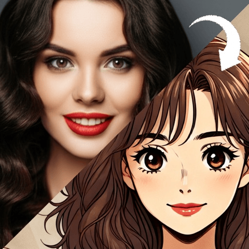
A storybook illustration look sits between painting and drawing: warm painted color, a soft drawn outline, gentle even lighting, and a scene built around the subject rather than a cropped background. Because it keeps an outline, it is more forgiving of ordinary phone photos than either oil or watercolor.
Best photo: even, front-facing light, a real smile or a clear expression, and a simple setting. Storybook images tell a small story, so an expression carries further here than in any other painted look.
How can you predict what will survive before you convert?
Squint at your photo. Narrow your eyes until the detail blurs and only the big shapes of light and dark remain. What you can still see is roughly what a painting conversion will keep. If your face disappears into the background when you squint, the painting will lose it too.
A second quick test is grayscale. Switch the photo to black and white in any editor. If the face separates clearly from the background in gray, the painted version will separate as well, whatever colors the style chooses.
What does not survive a painting conversion?
Some things reliably come out badly, and it saves time to know them in advance:
- Text and logos. Writing on a shirt or a sign becomes garbled marks. Crop it out or accept that it will look like nonsense lettering.
- Busy patterns. Stripes, checks and florals fight the brushwork and often turn into noise. Plain clothing converts better.
- Small faces in big scenes. A face that fills a tenth of the frame gets painted with the same size strokes as everything else, which leaves almost no marks for the features. Crop to the person first.
- Hands and glasses. Fingers can merge, and glasses frames may break or bend. Check them before anything else.
How do you judge a painted result?
Look for consistency first. The most common flaw is a face that looks photographic sitting inside a painted background, a pasted-on look that gives the conversion away. The strokes on the skin should match the strokes on the clothes and the background.
Then check the eyes, the hands and the hairline. If those are right, the rest usually is. And regenerate once or twice before deciding: a generation is an interpretation, so each run paints the photo a little differently, just as two painters would.
The same judging habits apply to other conversions; what a photo to anime conversion changes covers the line-drawn equivalent, and the photo checks in how to turn a photo into a cartoon apply here almost unchanged.
Which tool should you use?
There are four honest routes. Free web converters are fast and fine for testing a look, usually in exchange for credits, watermarks or sign-ups. General photo editors often include painting effects among many others. Dedicated apps focus on faces and a smaller set of looks. And a human painter working from your photo is slower and more expensive, but makes real decisions about what to keep.
Toonsta is one of the dedicated apps. Of the painted looks in this post, the one it ships is the storybook illustration, so that is the place to try a painted version of your photo in the app; oil painting and watercolor are covered on their style pages as reference rather than as app features. If you are after a painted avatar, the cartoon profile picture ideas cover how to crop soft-edged looks so they still read small.